Figma Is Not the Source of Truth—Your Design Tokens Are
Figma is commonly used to define visual intent such as typography, spacing, and layout.
In production, those same decisions need to be translated into enforceable configuration that applications can reliably consume.
Design tokens allow visual intent from Figma to be implemented consistently in code, without coupling runtime behavior to design tool.
From Figma Typography to Production Fonts
In Figma, fonts communicate usage and intent only; production-ready font files are sourced separately.
Start by inspecting text styles defined in Figma:
- Font family name
- Available weights (Light, Regular, Medium, Bold, etc.)
- Usage intent (body, heading, UI, icon)
Below example shows using Figma plugins (Right-click → Plugins → Manage plugins) to inspect font usage inside design file.
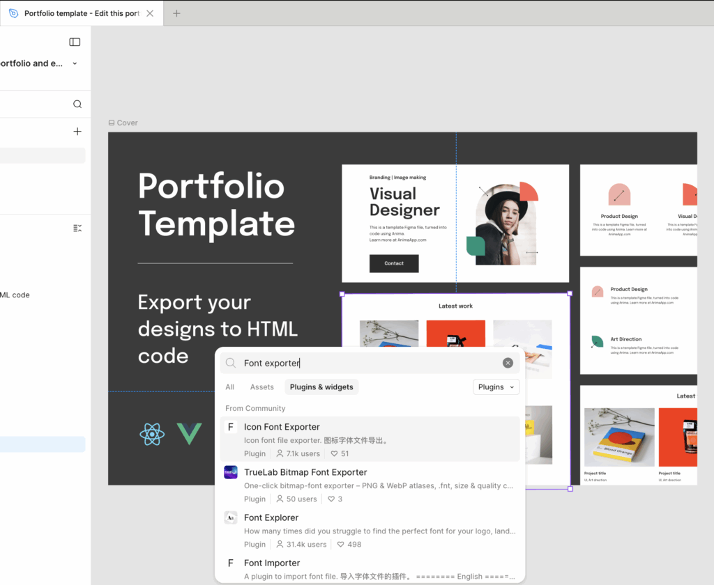
After teams have identified font usage in Figma, responsibility shifts from design inspection to code implementation.
Download font files from licensed source, then register them using @font-face as shown below.
Visit URL: https://www.myfonts.com/collections/avenir-font-linotype/
// Icomoon Font and Icomoon Path
$font-family-primary: "avenir" !default;
$font-path-primary: "../fonts" !default;
$font-path-primary-detail: "../fonts/avenir" !default;

@font-face {
  font-family: 'Avenir';
  src: url('#{$font-path-primary-detail}/Avenir-Light.ttf') format('truetype');
  font-weight: 300;
  font-style: normal;
}
...

// Font Families
$font-family-avenir: 'Avenir', sans-serif;
$font-family-apply: $font-family-avenir;

// Font IcoMoon
$<branch name>-ui-saas-kit: "\e900";
$<branch name>-digital-experience: "\e901";Typography tokens can reference only font families and weights registered at this stage.
Icon handling follows the same design-to-code enforcement model introduced earlier for typography. Figma SVGs are converted through IcoMoon into controlled icon assets.
Enforcing Iconography Through Controlled Icon Fonts
Start by extracting raw SVG markup from Figma using Copy as SVG.
<svg width="31" height="31" viewBox="0 0 31 31" fill="none" xmlns="http://www.w3.org/2000/svg">
    <path d="M0 15.45C0 6.91721 6.9172 0 15.45 0C23.9828 0 30.9 6.9172 30.9 15.45V30.9H0V15.45Z" fill="#F3AFA8"/>
</svg>Before generating an icon font, exported SVG files often require cleanup to remove unnecessary paths or adjust attributes that Figma cannot modify during export, such as fill color, width, or height.
Use the Load button to open the IcoMoon console, then import and configure SVG icons one by one.
After selecting icons, go to Generate Font to review or adjust glyph codes, then download the generated font files.
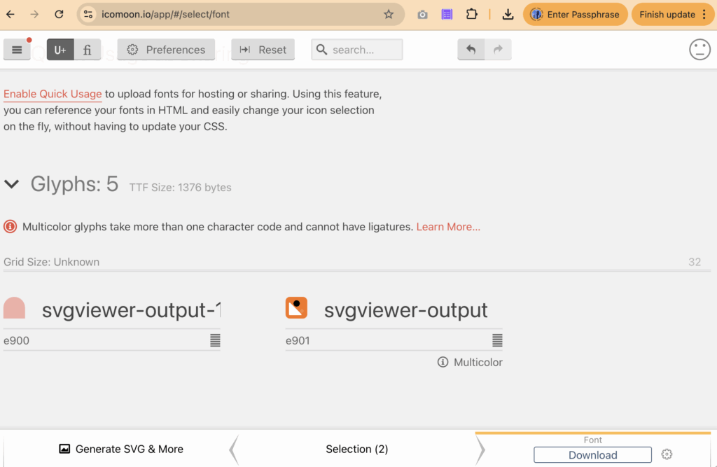
This explains the purpose of the icon font variables defined above.
// Font IcoMoon
$<branch name>-ui-saas-kit: "\e900";
$<branch name>-digital-experience: "\e901";With typography and iconography enforced, layout becomes the next system that must be defined in code.
Defining Layout Foundations Using Design Tokens
With typography and iconography enforced, layout becomes the next system that must be defined in code.
Once container boundaries are established, spacing rules can be applied safely without affecting surrounding components.
$container-max-width: 1440px;

@mixin container {
	max-width: $container-max-width;
	margin: 0 auto;
	width: auto;
	overflow: visible;
}

@mixin container-fullwidth {
	width: 100%;
	max-width: none;
	overflow: visible;
}With layout boundaries defined, teams must align on one spacing strategy.
- Raw spacing tokens, which prioritize visual parity with Figma
- Normalized spacing tokens, which prioritize consistency and scalability
Figma inspection often reveals irregular spacing values such as 90, 80, 43, 40, 32, 25, and 24.
$spacing-24: 24px;
$spacing-25: 25px;
$spacing-32: 32px;
$spacing-40: 40px;
$spacing-43: 43px;
$spacing-80: 80px;
$spacing-90: 90px;A normalized spacing scale consolidates raw spacing values into a smaller, reusable set for consistency and reuse:
// Spacing tokens derived from Figma inspection
$spacing-xxs: 4px;
$spacing-xs: 8px;
$spacing-sm: 16px;
$spacing-md: 24px;
$spacing-lg: 30px;
$spacing-xl: 45px;
$spacing-2xl: 60px;At this point—before any components are built—design intent across typography, iconography, layout, and spacing has been fully converted into enforceable tokens.
Alongside spacing, border radius values are also determined during Figma inspection.
$border-radius-32: 32px;
$border-radius-full: 1000px;Beyond static values, layout behavior also depends on responsive breakpoints.
Based on responsive requirements, breakpoint values can be defined as follows:
$breakpoint-container-sm: 440px;   // narrow layout / small container
$breakpoint-container-md: 1024px;  // standard content width
$breakpoint-container-xl: 1720px; // wide desktop layoutBeyond static values, layout behavior also depends on responsive breakpoints. Device-oriented semantic breakpoints can be added, but must align with team development and design decisions.
$breakpoint-xs: 480px;  // iPhones and small phones
$breakpoint-sm: 767px;  // Android phones, larger iPhones
$breakpoint-md: 1024px; // Tablets (iPad, Android tablets)
$breakpoint-lg: 1200px; // Small laptops
$breakpoint-xl: 1440px; // Laptops and desktopsWith container width and breakpoints defined, responsive mixins apply these rules consistently across components.
@mixin container-sm {
  @media (max-width: $breakpoint-container-sm) {
    max-width: $breakpoint-container-sm;
    margin-left: auto;
    margin-right: auto;
    width: 100%;

    @content;
  }
}

@mixin container-md {
  @media (min-width: ($breakpoint-container-sm + 1)) and (max-width: $breakpoint-container-md) {
    max-width: $breakpoint-container-md;
    margin-left: auto;
    margin-right: auto;
    width: 100%;

    @content;
  }
}

@mixin container-xl {
  @media (min-width: $breakpoint-container-xl) {
    max-width: $breakpoint-container-xl;
    margin-left: auto;
    margin-right: auto;
    width: 100%;

    @content;
  }
}With container boundaries and breakpoints in place, layout behavior such as padding, spacing, and component sizing can now be applied consistently using responsive mixins.
Applying Responsive Layout Contracts Across Components
With container and container-fullwidth mixins defined, layout behavior can now be applied through shared layout contract governing width, padding, and responsive behavior across components.
Layout contract applies only at container-level elements within component. Usage should not occur on internal content nodes such as text, icons, or buttons.
@mixin responsive-container {
	&:not(.full-width) {
		@include container-sm {
			padding-left: $spacing-16;
			padding-right: $spacing-16;
			box-sizing: border-box;
		}

		@include container-md {
			padding-left: $spacing-25;
			padding-right: $spacing-25;
			box-sizing: border-box;
		}

		@include container-xl {
			box-sizing: border-box;
		}
	}
}This mixin applies horizontal padding responsively while respecting full-width sections. When .full-width modifier is present, padding is intentionally skipped.
In practice, layout behavior follows consistent hierarchy:
- Full-width surface defines visual boundary of section
- Container constrains content width and applies responsive padding
- Internal elements remain layout-agnostic
Separation ensures layout rules do not leak into component internals. Components consume layout contract explicitly rather than redefining layout rules locally:
@include base.container;
@include base.container-fullwidth;
@include base.responsive-container;Because layout behavior is fully encoded in tokens and mixins, same contract can be reused outside CSS, such as structured input for AI-assisted component generation.
Use the provided layout contract (container, container-fullwidth, responsive-container mixins) as the single source of layout behavior.
```
see _layout.scss (contact me if you like this pattern)
```
Use the attached image as visual reference for structure and alignment only, not pixel-perfect styling.
Generate semantic HTML using AEM component naming (cmp-<name component>, cmp-<name component>__*).

(*) DOM structure rules (AEM-style):
- Each content component MUST use the following DOM hierarchy:
<section class="cmp-<component>" data-cmp-is="<component>">
  <div class="cmp-<component>__section">
    <div class="cmp-<component>__container">
    <!-- component content -->
    </div>
  </div>
</section>
- <section> is required for semantic content components.
- __section is responsible for full-width visuals only (backgrounds, gradients, vertical spacing).
- __container is the ONLY element allowed to apply layout mixins.

(*) Exceptions:
- Structural or chrome components (header, footer, nav) MAY replace <section> with semantic tags (header, footer, nav) and MAY use __bar instead of __section:
<header class="cmp-header">
  <div class="cmp-header__bar">
    <div class="cmp-header__container">
      <!-- content -->
    </div>
  </div>
</header>
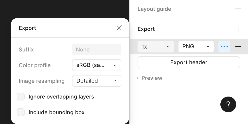
Want to have output fully HTML to view it?By unchecking Ignore overlapping layers during Figma export, a component can be flattened into single frame.
This exported image can then be attached alongside command to help AI agent interpret layout intent and generate accurate output.
Example below shows full HTML output generated using layout contract, demonstrating layout behavior consistency outside original SCSS environment.
<!DOCTYPE html>
<html lang="en">
<head>
    <meta charset="UTF-8" />
    <title>Header Preview</title>
    <meta name="viewport" content="width=device-width, initial-scale=1" />
    <style>
        :root {
            --container-max-width: 1440px;
            --spacing-16: 16px;
            --spacing-25: 25px;
        }

        body {
            margin: 0;
            font-family: system-ui, -apple-system, sans-serif;
            background: #0b0b12;
        }

        .cmp-header__container {
            max-width: var(--container-max-width);
            margin: 0 auto;
            width: auto;
            box-sizing: border-box;
            display: flex;
            align-items: center;
            justify-content: space-between;
            height: 120px;
        }

        @media (max-width: 440px) {
            .cmp-header__container {
                padding-left: var(--spacing-16);
                padding-right: var(--spacing-16);
            }
        }

        @media (min-width: 441px) and (max-width: 1024px) {
            .cmp-header__container {
                padding-left: var(--spacing-25);
                padding-right: var(--spacing-25);
            }
        }

        .cmp-header__bar {
            width: 100%;
            background: linear-gradient(
                    120deg,
                    #0b0620 0%,
                    #1b1445 40%,
                    #3c4fcf 100%
            );
        }

        .cmp-header__nav-list {
            list-style: none;
            display: flex;
            gap: 32px;
            margin: 0;
            padding: 0;
        }

        .cmp-header__nav-link {
            color: #ffffff;
            text-decoration: none;
            font-size: 15px;
            font-weight: 500;
            opacity: 0.9;
        }

        .cmp-header__nav-link:hover {
            opacity: 1;
        }

        .cmp-header__brand-logo {
            width: 190px;
            height: 40px;
            object-fit: contain;
            display: block;
        }
    </style>
</head>
<body>
    <header class="cmp-header" data-cmp-is="header">
        <div class="cmp-header__bar">
            <div class="cmp-header__container">
                <div class="cmp-header__brand">
                    <a href="/" class="cmp-header__brand-link">
                        <img class="cmp-header__brand-logo" src="<your logo path>"/>
                    </a>
                </div>
                <nav class="cmp-header__nav" aria-label="Primary navigation">
                    <ul class="cmp-header__nav-list">
                        <li class="cmp-header__nav-item">
                            <a href="javascript:void(0);" class="cmp-header__nav-link">Our Work</a>
                        </li>
                        <li class="cmp-header__nav-item">
                            <a href="javascript:void(0);" class="cmp-header__nav-link">Capabilities</a>
                        </li>
                        <li class="cmp-header__nav-item">
                            <a href="javascript:void(0);" class="cmp-header__nav-link">About Us</a>
                        </li>
                    </ul>
                </nav>
            </div>
        </div>
    </header>
</body>
</html>Once generated output is validated against Figma’s blueprint, typography-related properties are reordered and marked, preparing extraction into shared mixins before building _typography.scss.
.cmp-header__nav-link {
   text-decoration: none;
   font-family: 'Avenir', sans-serif;
   font-style: normal;
   font-weight: 500;
   font-size: 16px;
   line-height: 150%;
   letter-spacing: 0.01em;
   color: #FFFFFF;
}Refactored to prepare typography mixin extraction:
.cmp-header__nav-link {
  text-decoration: none;
  color: #ffffff;

  /* Typography role (to be replaced by mixin) */
  font-family: 'Avenir', sans-serif;
  font-style: normal;
  font-weight: 500;
  font-size: 16px;
  line-height: 150%;
  letter-spacing: 0.01em;
}Same refactoring pattern applies to spacing-related values, including gap:
.cmp-header__nav-list {
    display: flex;
    list-style: none;
    margin: 0;
    padding: 0;

    /* Typography role (to be replaced by mixin) */
    gap: 32px;
}After isolating typography-related properties, _typography.scss centralizes font family, weight, size, line height, and letter spacing, with responsive behavior for small, standard, and wide layouts.
For example:
@use "../variable" as *;

// Font families
$font-primary: $font-family-apply !default;

// Font weights
$weight-medium: 500;

// Font sizes
$font-size-sm: 16px;

// Line heights
$line-height-sm: 24px;

// Letter spacing
$letter-spacing-tight: -0.01em;

// Common text styles mixin
@mixin text-style($size, $weight, $line-height, $font-primary) {
  font-size: $size;
	font-weight: $weight;
	line-height: $line-height;
	font-family: $font-primary;
	margin: 0;
}

@mixin text-nav {
  @include text-style($font-size-sm, $weight-medium, $line-height-sm, $font-primary);
}Similarly, _layout.scss can be extended with additional mixins for padding, margin, gap, and flex behavior to support more complex layout patterns.
@mixin responsive-nav-list {
  gap: $spacing-32;
}Next section demonstrates how responsive behavior, defined through layout mixins, is applied to interactive patterns such as navigation toggles.
Modeling Responsive Behavior with Layout Mixins
Responsive behavior often requires structural changes such as navigation collapse, toggle visibility, and layout reflow.
The following example adjusts raw HTML structure to support these behaviors while keeping layout rules driven by mixins.
<!DOCTYPE html>
<html lang="en">
<head>
    <meta charset="UTF-8" />
    <title>Header – Responsive (Token Breakpoints)</title>
    <meta name="viewport" content="width=device-width, initial-scale=1" />

    <style>
        :root {
            --container-max-width: 1440px;
            --spacing-16: 16px;
            --spacing-25: 25px;
        }

        body {
            margin: 0;
            font-family: system-ui, -apple-system, sans-serif;
            background: #0b0b12;
        }

        .cmp-header__bar {
            position: relative;
            width: 100%;
            background: linear-gradient(
                    120deg,
                    #0b0620 0%,
                    #1b1445 40%,
                    #3c4fcf 100%
            );
        }

        .cmp-header__container {
            max-width: var(--container-max-width);
            margin: 0 auto;
            display: flex;
            align-items: center;
            justify-content: space-between;
            height: 120px;
            box-sizing: border-box;
        }

        .cmp-header__brand-logo {
            width: 190px;
            height: auto;
            display: block;
        }

        .cmp-header__nav {
            display: block;
        }

        .cmp-header__nav-list {
            display: flex;
            list-style: none;
            margin: 0;
            padding: 0;
            gap: 32px;
        }

        .cmp-header__nav-link {
            display: block;
            text-decoration: none;
            color: #ffffff;
            font-weight: 500;
            font-size: 16px;
            line-height: 150%;
            letter-spacing: 0.01em;
        }

        .cmp-header__toggle {
            display: none;
            background: none;
            border: 0;
            cursor: pointer;
            padding: 0;
        }

        .cmp-header__toggle span {
            display: block;
            width: 22px;
            height: 2px;
            background: #ffffff;
            margin: 5px 0;
        }

        /* =====================================================
           MOBILE (≤440px)
        ===================================================== */
        @media (max-width: 440px) {
            .cmp-header__container {
                height: 72px;
                padding: 0 var(--spacing-16);
            }

            .cmp-header__brand-logo {
                width: 140px;
            }

            .cmp-header__toggle {
                display: block;
            }

            .cmp-header__nav {
                position: absolute;
                top: 100%;
                left: 0;
                width: 100%;
                display: none;
                background: linear-gradient(
                        120deg,
                        #0b0620 0%,
                        #1b1445 40%,
                        #3c4fcf 100%
                );
            }

            .cmp-header__nav--open {
                display: block;
            }

            .cmp-header__nav-list {
                flex-direction: column;
                gap: 0;
            }

            .cmp-header__nav-link {
                width: 100%;
                padding: 16px;
                border-top: 1px solid rgba(255,255,255,0.12);
            }
        }

        /* =====================================================
           TABLET (441px – 1024px)
        ===================================================== */
        @media (min-width: 441px) and (max-width: 1024px) {
            .cmp-header__container {
                height: 72px;
                padding: 0 var(--spacing-25);
            }

            .cmp-header__brand-logo {
                width: 140px;
            }

            .cmp-header__toggle {
                display: block;
            }

            .cmp-header__nav {
                position: absolute;
                top: 100%;
                left: 0;
                width: 100%;
                display: none;
                background: linear-gradient(
                        120deg,
                        #0b0620 0%,
                        #1b1445 40%,
                        #3c4fcf 100%
                );
            }

            .cmp-header__nav--open {
                display: block;
            }

            .cmp-header__nav-list {
                flex-direction: column;
                gap: 0;
            }

            .cmp-header__nav-link {
                width: 100%;
                padding: 16px 24px;
                border-top: 1px solid rgba(255,255,255,0.12);
            }
        }
    </style>
</head>

<body>
<header class="cmp-header" data-cmp-is="header">
    <div class="cmp-header__bar">
        <div class="cmp-header__container">
            <div class="cmp-header__brand">
                <a href="/">
                    <img class="cmp-header__brand-logo" src="<your logo path>"/>
                </a>
            </div>
            <button class="cmp-header__toggle" aria-label="Toggle menu">
                <span></span>
                <span></span>
                <span></span>
            </button>
            <nav class="cmp-header__nav" aria-label="Primary navigation">
                <ul class="cmp-header__nav-list">
                    <li><a href="#" class="cmp-header__nav-link">Our Work</a></li>
                    <li><a href="#" class="cmp-header__nav-link">Capabilities</a></li>
                    <li><a href="#" class="cmp-header__nav-link">About Us</a></li>
                </ul>
            </nav>

        </div>
    </div>
</header>

<script>
    const toggle = document.querySelector('.cmp-header__toggle');
    const nav = document.querySelector('.cmp-header__nav');

    toggle.addEventListener('click', () => {
        nav.classList.toggle('cmp-header__nav--open');
    });
</script>

</body>
</html>With structural markup in place, responsive behavior can now be applied through layout mixins rather than inline media queries.
// Responsive nav list mixin - applies gap on mobile & tablet
@mixin responsive-nav-list {
  gap: $spacing-32;

  @include container-sm {
    gap: 0;
  }

  @include container-md {
    gap: 0;
  }
}TODO